Converting a photo to pixel art: which palette and resolution to pick
Converting a photo to pixel art is not a filter and done. The result depends on three decisions: how many pixels the grid has, which palette you use and whether you dither. Change one of the three and a recognisable portrait becomes a smudge. Here is how to choose each one.
1. The three decisions that define the result
Pixel art is an image with very few pixels, each one visible. Reducing a photo to that grid means every pixel now represents a whole region of the original. Three parameters control how that reduction happens:
- Grid resolution: how many pixels wide the result is. This is the parameter that changes the result most.
- Palette: the limited set of colours available. Fewer colours means more stylised and harder to recognise.
- Dithering: whether pixels of two colours are mixed to simulate an in-between tone, or each area uses a flat colour.
2. Choosing the resolution
Resolution is the first thing to decide because it conditions everything else. A practical guide by use:
| Use | Width in pixels | Why |
|---|---|---|
| Avatar or icon | 32 to 64 | Seen small; more pixels are lost |
| Recognisable portrait | 64 to 128 | Keeps features without losing the pixel look |
| Scene or landscape | 128 to 256 | Needs more detail to read |
| T-shirt print | 128 to 256 | Scales without interpolation and the pixel stays clean |
Below 32 pixels wide a portrait stops being recognisable. Above 256 the result reads as a noisy photo rather than pixel art. The sweet spot for a portrait is usually between 64 and 96.
3. The classic palettes and what each is for
The palette is not just aesthetic: it defines how much information survives. These are the most used and what for:
| Palette | Colours | When to use it |
|---|---|---|
| Game Boy (DMG) | 4 greens | Instant retro look. Ideal for avatars and video game shirts |
| NES | 54 | More variety while keeping the 8-bit feel. Good for scenes |
| C64 | 16 | Saturated, very recognisable colours. Works well with illustration |
| PICO-8 | 16 | A modern, well-balanced palette. The best one to start with |
| Grayscale | 4 to 8 | Portraits and old photos. Removes the distraction of colour |
With four colours the result is a logo; with sixteen, an illustration. If the goal is that a person is recognisable, do not go below eight colours.
4. Dithering: yes or no
Dithering mixes pixels of two colours to simulate an in-between tone. Without it, each area uses a flat colour and the result has hard edges and a poster look. With it, there is more sense of gradient but the image looks dirtier.
The rule: dithering for landscapes and sky gradients, no dithering for portraits and logos. On a face, dithering adds a dot texture that does not help you read the features.
5. Preparing the photo before converting
The result depends heavily on the input photo. Three prior adjustments that improve almost any conversion:
- Crop to the subject. A photo with lots of background turns the subject into a small smudge.
- Raise the contrast. Reduced to few colours, midtones clump together and the image flattens.
- Remove the background if it is noisy. A complex background becomes a shapeless mass of pixels.
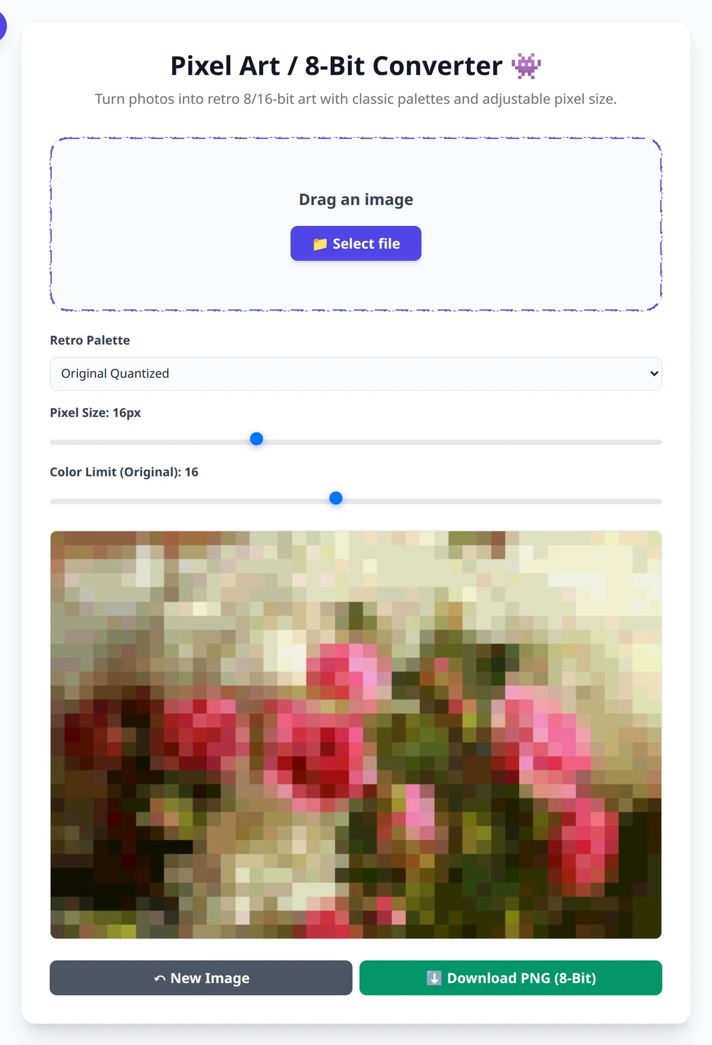
With OmniPixy's pixel art converter you can adjust resolution, palette and dithering and see the result before downloading. All in the browser, without uploading the photo.
6. Where the result gets used
Pixel art has one practical problem: it looks bad when scaled with interpolation. To use it on a shirt or a large screen you have to scale it with nearest neighbour, which doubles pixels without smoothing. Scale it with a normal program and the result is blurry and loses the whole effect.
For a forum or social avatar, export at the final size directly. For print, export at 128-256 pixels and scale with nearest neighbour up to the print size at 300 dpi.
Convert your photo to pixel art
Pick palette, resolution and dithering, then download the result. No signup, nothing uploaded.
Open the pixel art converterFrequently Asked Questions (FAQ)
How many pixels should my pixel art have?
64 to 96 wide for a recognisable portrait, 32 to 64 for an avatar and 128 to 256 for a scene or print. Below 32 a portrait stops being recognisable.
Which palette should I start with?
PICO-8, with 16 colours. It is the most balanced and the least surprising. For an instant retro look, the 4-green Game Boy palette.
Should I enable dithering?
For landscapes and gradients yes; for portraits and logos no. On a face, dithering adds a dot texture that gets in the way.
Why is my pixel art blurry when enlarged?
Because it is being scaled with interpolation. You have to scale with nearest neighbour, which doubles pixels without smoothing.
Is the pixel art generated on my device?
No. The conversion runs in your browser: the image never leaves your computer.
Conclusion
Pixel art depends on three decisions and none of them is a filter: grid resolution, palette and dithering. Pick resolution by final use, palette by the style you want, and dithering only when there are gradients. And always scale with nearest neighbour.